Modern Family Tudor


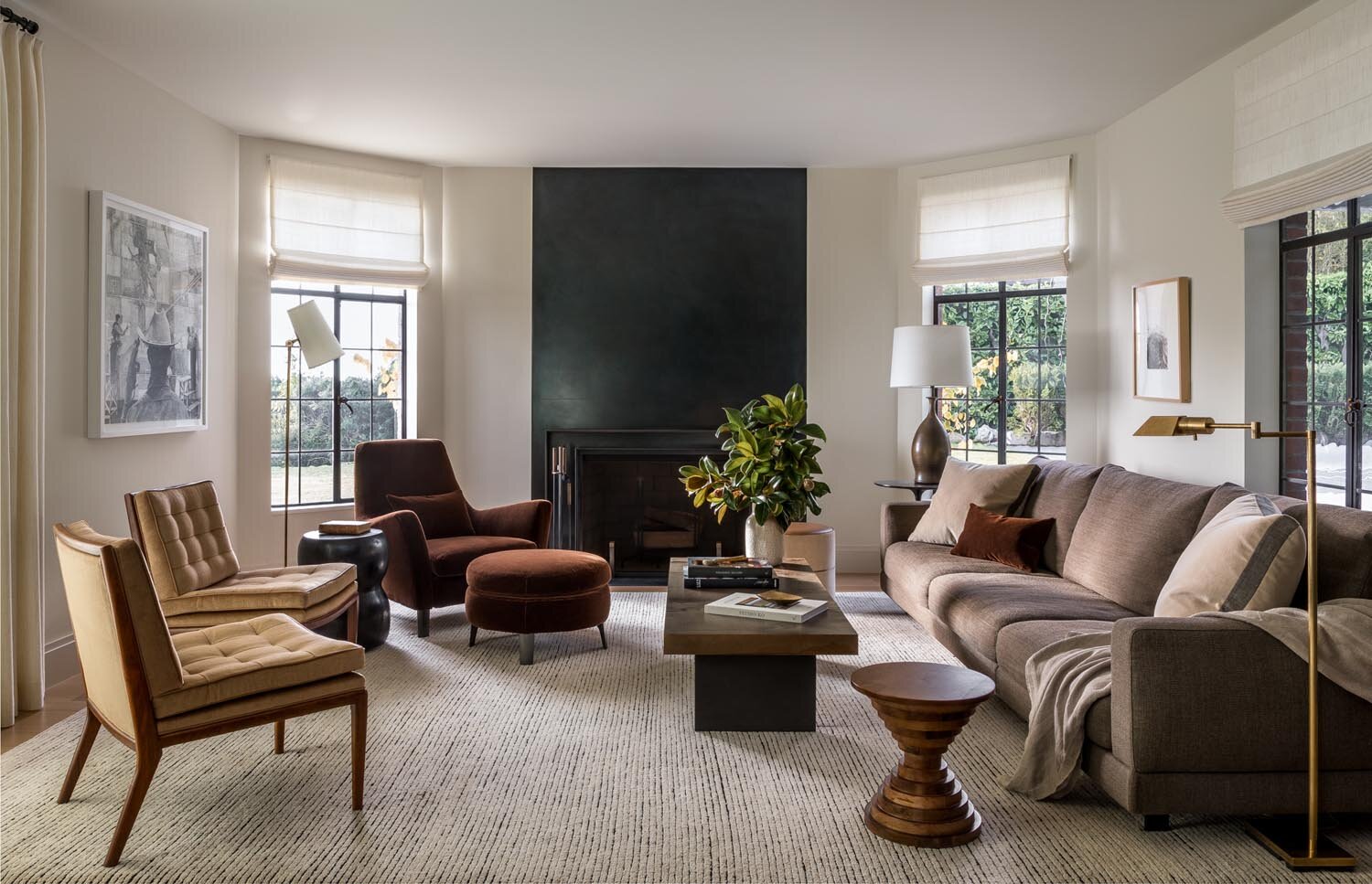
When our clients purchased this 1931 home, it was full of charming period details—but it also came with serious missed opportunities. The result is a contemporary family home with modern fixtures and brighter finishes and an interior that now feels appropriate and casually luxurious.


Tudor-Web-1.jpg


Break Through

Typical of houses of this era, the original kitchen was dark and tucked in on the wrong side of the house. The sunny south-facing yard was a huge asset, but disconnected from spaces for family and entertaining friends. To tap into this potential, the kitchen was flipped to the sunny side and opened to the yard. The major living areas now connect to each other, and a new stair anchors the house from top to bottom.


Tudor-style kitchen


open format outdoor dining area


Classic and Modern

The rooms felt too closed and formal for modern family life, and while the period details were charming, many of the finishes were dark and dated. A high degree of customization in all finishes and furnishings allowed them to have pieces tailored to the needs of a busy young family without compromising on the beauty of the spaces.


modern family tudor staircase


Project Team

DeForest Architects Team | John DeForest AIA, Mark Slivka
Interior Design | Ore Studios
Contractor | Schultz Miller
Structural | Swenson Say Faget
Photography | Haris Kenjar


Publications

Luxe Interiors + Design, May/June 2019


lakewood mid-century

lakewood mid-century

NEXT UP:

Lakewood Mid-Century

A mid-century remodel that honors its roots while giving it a new twist.

 
lighter-darkblue.jpg